 Business cards are ubiquitous. Everyone from babysitters to CEO’S carry them. But did you know that these tiny marketing tools have been around since the 17th century! They were originally intended to announce the impending arrivals of important and aristocratic individuals. Cards designed to represent individuals were referred to as calling cards. And business cards, (as we know them today) were called trade cards.
Over time they evolved, becoming more ornate and elaborate. Featuring elegant engraving and in many cases crafted by hand, they were truly tiny works of art. Special trays were placed at the front doors of all wealthy homes so individuals could leave their cards for their hosts. Cards from famous guests were coveted and traded much like sports cards are today.
Modern business cards have come a long way since those early days, but their purpose remains the same. Most business cards today are a slick and compact 2 by 3.5 inches. In that tiny space you must grab the reader’s attention, make a positive impression, and be memorable. Business cards are in essence, a teeny tiny commercial. These pint-sized marketing vehicles must properly convey what you do, establish credibility, and stand out.
Today’s digital communication devices and fast paced work environments leave little time for a prospect to read, much less glance at a business card. Therefore, it is essential that your card is well designed, and has right elements to stand out from the pack.
How to make your Business Card pass the Three Second Glance Test
Look at any card you have on hand for three seconds and turn it over. What do you remember? What stood out, (if anything)? What was your impression?
This experiment is meant to illustrate the challenge of creating a memorable, unique business card. The key is to create a card that is consistent with your intentions, is credible, professional and sets you apart. Your business card should incorporate these six elements of design. If it doesn’t, it’ might be time for a makeover.
Information: Less is more:
Much like the old cop and detective shows, stick to the facts! Make sure to include your name, title, and contact information. Usually just a phone number and an email is enough, but if you have a physical presence like a store or kiosk, include that address as well. If you are web based, don’t forget your website! Anything more is clutter.
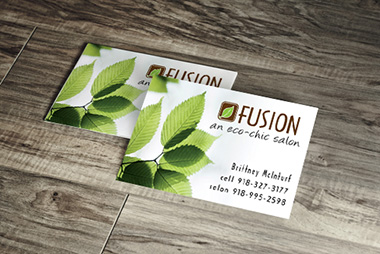
Logo Placement:
The easiest way to brand yourself at a glance is to incorporate your company logo. That is of course, providing you have a well-designed logo. The logo can be placed front and center, or in a prominent location such as the lower right hand corner. Make sure it’s sized large enough that you can clearly read it. If it’s too small, you’ll end up with a fuzzy blob…too large, and you run the risk of overwhelming the entire card and crowding out other relevant information.
Sam Carter is Director of the USC Design Studio. He is also a pop art gallery artist and theme park designer, and held a seven year stint designing for Disney. Sam spoke to Overnight Prints about what it takes to make a business card pop:
Fonts
The font should be legible and appropriate for your industry. If you are an accountant or dentist, you’ll want to stay with conservative fonts, like Arial, Helvetica or Calibri. If you are an artist or in childcare, use a more whimsical font, like Ravie or Comic Sans. Your card should speak for you when you aren’t there.
Invest in solid quality cardstock. Cards can get jammed into pockets and wallets and often end up in desk drawers. Choose a thick durable stock that can take some abuse without falling apart. Use high quality inks that are crisp and won’t fade. If you’ll be adding a photograph to your card, consider using a glossy stock to highlight the image. For simple designs without images, a matte finish is fine.
Colors
Keep in mind that color psychology can be powerful. Generally you want your color scheme to be somewhat limited. There is a difference between boring and clean design. Too many colors can be distracting. Plain black and white can be snooze inducing. Using a two color card, like black and a highlight color, can add depth and emphasize your message. Business cards that are crowded, confusing, or look cheap can reflect negatively on you. On the flip side, a sleek, elegant card that clearly states who you are and what you do can command as much respect as that first initial handshake!
Utilize the Back
How many times have you tried to write something on the back of a business card only to find that it wasn’t “writable?” Make sure the back of your business card is writable. Save some space on the back of your card for prospects to take notes about your services, or where they met you.
Then you can get creative. Here are five clever ideas for the back side of your business card:
Business cards are ubiquitous. Everyone from babysitters to CEO’S carry them. But did you know that these tiny marketing tools have been around since the 17th century! They were originally intended to announce the impending arrivals of important and aristocratic individuals. Cards designed to represent individuals were referred to as calling cards. And business cards, (as we know them today) were called trade cards.
Over time they evolved, becoming more ornate and elaborate. Featuring elegant engraving and in many cases crafted by hand, they were truly tiny works of art. Special trays were placed at the front doors of all wealthy homes so individuals could leave their cards for their hosts. Cards from famous guests were coveted and traded much like sports cards are today.
Modern business cards have come a long way since those early days, but their purpose remains the same. Most business cards today are a slick and compact 2 by 3.5 inches. In that tiny space you must grab the reader’s attention, make a positive impression, and be memorable. Business cards are in essence, a teeny tiny commercial. These pint-sized marketing vehicles must properly convey what you do, establish credibility, and stand out.
Today’s digital communication devices and fast paced work environments leave little time for a prospect to read, much less glance at a business card. Therefore, it is essential that your card is well designed, and has right elements to stand out from the pack.
How to make your Business Card pass the Three Second Glance Test
Look at any card you have on hand for three seconds and turn it over. What do you remember? What stood out, (if anything)? What was your impression?
This experiment is meant to illustrate the challenge of creating a memorable, unique business card. The key is to create a card that is consistent with your intentions, is credible, professional and sets you apart. Your business card should incorporate these six elements of design. If it doesn’t, it’ might be time for a makeover.
Information: Less is more:
Much like the old cop and detective shows, stick to the facts! Make sure to include your name, title, and contact information. Usually just a phone number and an email is enough, but if you have a physical presence like a store or kiosk, include that address as well. If you are web based, don’t forget your website! Anything more is clutter.
Logo Placement:
The easiest way to brand yourself at a glance is to incorporate your company logo. That is of course, providing you have a well-designed logo. The logo can be placed front and center, or in a prominent location such as the lower right hand corner. Make sure it’s sized large enough that you can clearly read it. If it’s too small, you’ll end up with a fuzzy blob…too large, and you run the risk of overwhelming the entire card and crowding out other relevant information.
Sam Carter is Director of the USC Design Studio. He is also a pop art gallery artist and theme park designer, and held a seven year stint designing for Disney. Sam spoke to Overnight Prints about what it takes to make a business card pop:
Fonts
The font should be legible and appropriate for your industry. If you are an accountant or dentist, you’ll want to stay with conservative fonts, like Arial, Helvetica or Calibri. If you are an artist or in childcare, use a more whimsical font, like Ravie or Comic Sans. Your card should speak for you when you aren’t there.
Invest in solid quality cardstock. Cards can get jammed into pockets and wallets and often end up in desk drawers. Choose a thick durable stock that can take some abuse without falling apart. Use high quality inks that are crisp and won’t fade. If you’ll be adding a photograph to your card, consider using a glossy stock to highlight the image. For simple designs without images, a matte finish is fine.
Colors
Keep in mind that color psychology can be powerful. Generally you want your color scheme to be somewhat limited. There is a difference between boring and clean design. Too many colors can be distracting. Plain black and white can be snooze inducing. Using a two color card, like black and a highlight color, can add depth and emphasize your message. Business cards that are crowded, confusing, or look cheap can reflect negatively on you. On the flip side, a sleek, elegant card that clearly states who you are and what you do can command as much respect as that first initial handshake!
Utilize the Back
How many times have you tried to write something on the back of a business card only to find that it wasn’t “writable?” Make sure the back of your business card is writable. Save some space on the back of your card for prospects to take notes about your services, or where they met you.
Then you can get creative. Here are five clever ideas for the back side of your business card:


 (10 votes)
Sign Up For Overnight Prints Newsletter:
 Custom Design vs. Template
 How Old Fashioned Marketing can Impact your Small Business
 Grow your Small Business with Novelty Notepads
 5 Things Every Freelancer Needs to be Successful