
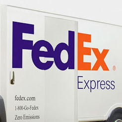
Among graphic designers, the FedEx logo is legendary. With over 40 prestigious design awards under its belt—and a coveted spot in Rolling Stone magazine’s 2003 best logos list—the hushed, reverent tones in which students, professors, and professionals discuss it conveys well-deserved awe.
Lindon Leader created the iconic mark in 1994 while working as a senior design director at Landor Associates in San Francisco. Tasked with conceiving a new logo for the (then) Federal Express brand, he produced 200 different design concepts before finessing one to perfection: a bold font, brilliant orange and purple, and that legendary arrow, hidden within the whitespace.
“I strive for two things in design: simplicity and clarity,” Leader once said. “Great design is born of those two things.” He’s not alone in this belief, for simplicity is at the core of each of the world’s greatest logo designs.
Let’s think about this for a moment.
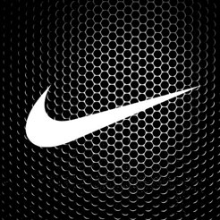
Google, Nike, Apple, IBM
It’s impossible to read those words without visualizing the logos. From the colorful wordmark to the eloquent swoosh; from the unmistakable apple to the eight blue bars, each is simple, memorable, timeless, versatile, and appropriate. They all contain—not coincidentally—the five essential elements of effective logo design.
Why does it matter?
Because effective logos capture the attention of prospects, stick in the minds of current customers, and can even turn one-time purchasers into loyal followers.
Sounds pretty great, right? Your company logo can do this, too—as long as you keep it:
Simple logos are easily recognizable. You’d never mistake Apple’s apple for any other fruit, even when zipping past a billboard at 70 miles per hour.
A memorable logo springs to mind at the mere mention of the company name—or, sometimes, even the product. Who doesn’t picture the magnificent golden arches when they hear the words “French fries?”
Graphic designers, art directors, rebranding campaigns… these things cost money—something most small business owners would rather reinvest in their companies in other ways. Timeless logos last for decades. Just consider Coca-Cola’s elegant red script. The mark is virtually the same as it was in 1885.
The best logos, like the Nike swoosh, are equally fantastic in color, grayscale, black and white, or reverse print. They also work well at any size, whether printed on postcards, brochures, flyers, or billboards.
The best logos “speak” to the appropriate audience, effortlessly melding color, font, and graphics to convey the essence of the brand. The Toys “R” Us logo evokes memories of childish fun, while the Harley-Davidson mark channels a sense of cool.
Paul Rand, the graphic designer famous for the creation of enduring corporate marks along the likes of ABC and UPS (and that IBM logo we mentioned earlier), once said, “A logo does not sell (directly), it identifies. A logo derives meaning from the quality of the thing it symbolizes, not the other way around.”
Your logo is the face your business presents to the world, whether potential clients are reading your brochure, surfing your website, or pulling your latest postcard from their mailbox. If it is anything, it must be simple. But don’t stop there. Make your mark memorable, timeless, versatile, and appropriate as well. When you combine all five essential elements, you create marketing magic.
Courtney’s Action Items
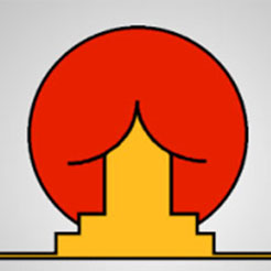
Here are some examples of logos that were not well thought out: Learn what not to do from these designs:
Tell us what topics you want to read about/send comments or suggestions: resourcecenter@overnightprints.com

 (17 votes)
Sign Up For Overnight Prints Newsletter:
 Custom Design vs. Template
 3 Visual Elements that Encourage Trust
 Best Practices in Graphic Design
 Effective Branding