Consumers make a subconscious decision about a product, person or service in 90 seconds or less
, according to a study conducted by The Institute for Color Research.The same study shows that aesthetics, (color) influences the buying decision more than any other factor. This is especially true for marketing collateral, including your printed materials and website. Therefore the colors you use to advertise your business can be bring people in the door, or turn them the away. Consider this:
It’s important to test your colors. Companies that take the time to test colors with their demographic audience are more successful than their counterparts. Take a few minutes to do a simple color test. It will be time well spent. This article will teach you how to choose colors that resonate best with your target audience, convey the proper message about your brand, and make a positive, lasting first impression. And finally, you’ll be given a quick easy method to do your own test:
Best practices in color psychology suggest using color tones, schemes and styles that resonate well with your target audience, and instill a sense of quality and credibility. This may require some simple market research on your part, but here are the basics.
Factors to consider when choosing your colors:Age of Audience-Choose colors that will appeal to the demographics of your market. For example, yellow is most often associated with youth and vitality, while tones of blue usually attract an older, more conservative audience.
Type of product/service-Your color scheme should be appropriate for the service or product you sell. If your business is organic or environmentally friendly, use greens and browns. If you’re in the medical industry, use blues. Silvers and blacks tend to attract a more elegant, upscale, established audience.
When choosing your colors, start with the basics. Your printed marketing materials are powerful tools when it comes to color psychology and making a good first impression. Your color schemes can cause a person to pick up the phone to learn more about you, or throw the material away and move to your competition. That’s because colors, (like words) can actually make people feel emotions.
What do you want your marketing material to say about you? How can you make sure it resonates with your target market? You want your marketing collateral to instill “feel good” emotions, stand out, and make a positive first impression.
Use this guide for choosing the best colors to market your small business.
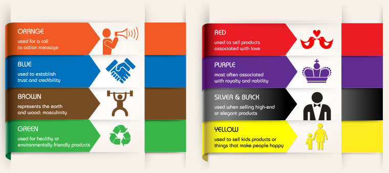
Reds: Reds can invoke a feeling of warmth, but red is also a bold color. It can be used to represent heat, rage, fire, passion, romance…all strong elements and emotions. Red is often used by fast food chains because it is said to stimulate the appetite. It is also often associated with excitement and danger and is considered the most powerful of all colors.
Orange: Orange can represent a cheerful warm feeling, but it also represents caution and excitement. It can be a subconscious prompting to “act now.” Thus you’ll sometimes see orange buttons on websites with a call to action like, Purchase today and get 15%off.
Yellow: While yellow stands out to the eye, too much yellow can be hard on the eyes causing fatigue. Orange is partially comprised of yellow, so it has cheerful properties. Yellow is considered the most visible color and is usually the first thing the eye seeks out, when facing a wide variety. This alone is why the majority of road caution signs are yellow. Yellow is also considered to be a stimulating color.
Here are a couple of excellent examples of how Overnight Prints customers are using proper color psychology in their marketing materials. Pink represents sweetness and softness. Green exudes life, health and nature.
Blues and Lavenders:
Blue is the color most preferred by most men. It also invokes a feeling of calm and serenity, and can curb the appetite. Prisons often paint their walls light blue, as a means to calm the inmates. Dark blue is often used by companies in the medical and financial industries, because it establishes trust and credibility.Gray: Gray is a neutral color and pairs well with almost any other color. Gray can be considered a gentle color but can also represent loneliness and sadness. When used in conjunction with other colors, it acts as a booster, enhancing whatever it is placed next to.
Pink: Pink is considered by many to be a gender-specific color. Pink represents youth, innocence, sweetness and softness. Light pink can also convey weakness, so use judiciously.
Black and silver: These colors are often associated with exclusivity, elegance and power. They are also the traditional color of death and fear. Negativity aside, black can be incredibly powerful when used properly and can help to elevate another color to an even more impactful level.
Purple: Purple is most often associated with royalty and nobility. As a solid blend of the strength and passion of red and the dignity and masculinity of blue, it’s a color that has a quiet power. Be cautious, however, as purple is actually the color of mourning in some Asian countries.
Green: represents health, life, rebirth and nature. Think spring and grass and new growth. Green is also often associated with money and wealth.
Brown: Brown is considered a strong and solid color. Brown represents the earth and wood, both of which are considered masculine. Brown is considered neutral and can be paired with almost any other color. Be cautious though, because when used alone, it can represent boredom. Dark brown, is often tied to opulence.
White: White can have a multitude of meanings, from purity and innocence to cowardice and emptiness. White can be subtle and can also be used to accentuate and highlight other colors. Colors on their own are powerful. When properly combined, they can convey messages and invoke strong feelings. Remember, you only get one chance at a first impression.
Action Items:Test your Colors
Create a simple paper coupon offering 25% or 30% off for the month of May. Use the same message and make four versions: Blue & White, Orange & White, Green & White, and Red & White. Include your phone number. Ask the customer to request a specific person when they call. Use a different name for each person. That way you can track which color is generating the most responses.
Orange: Ask for Rob
Blue: Ask for John
Green: Ask for Tim/
Red: Ask for Doug
You can use an online printing service or choose this quick and dirty way method:
What topics do you want to read about? Email resourcecenter@overnightprints.com


 (13 votes)
Sign Up For Overnight Prints Newsletter:
 Choosing the Right Font
 The Power of Words (in sales)
 Breaking Sales Records with Creative Print Marketing
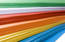 Choosing the Best Paper for Your Print Project